
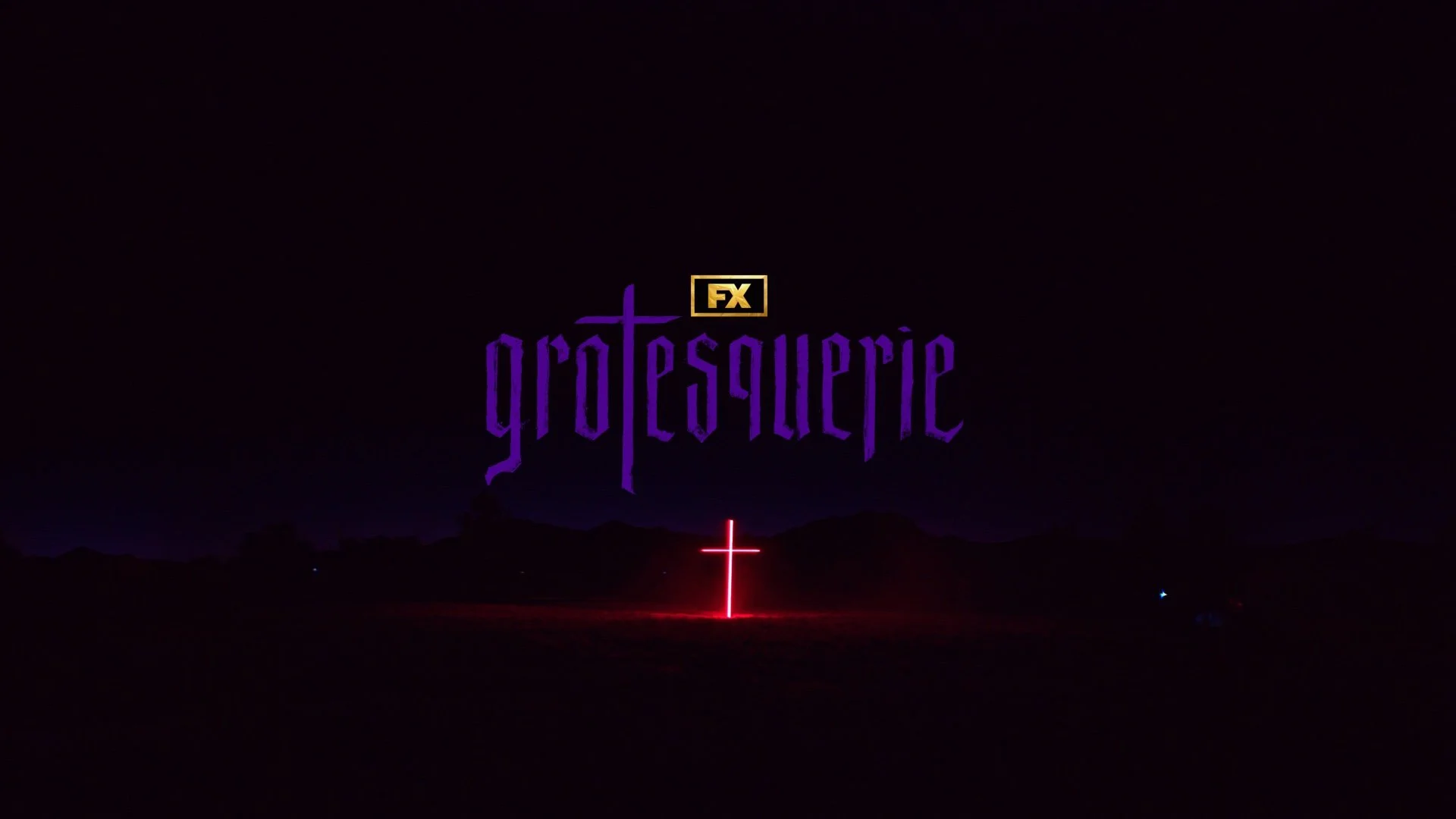
Grotesquerie was a show package that gave me the opportunity to both design and animate while exploring a wide range of visual directions. My work spanned from illustrating and animating cult-inspired graphics to developing the killer’s scrawled assets, which helped establish the show’s unsettling, serial-killer tone. Throughout the process, I focused on balancing that eerie aesthetic with the deeper mystery and religious themes woven into the narrative.
Symbol exploration
During the early stages of developing the Grotesquerie package, I explored incorporating traditional pen-and-ink techniques into both the design and typographic animation. The goal was to evoke a sense of unease—something eerie, cult-like, and subtly unsettling. This process became an opportunity to experiment with handcrafted marks and custom script, building a visual language that reinforced the tone and atmosphere of the show.
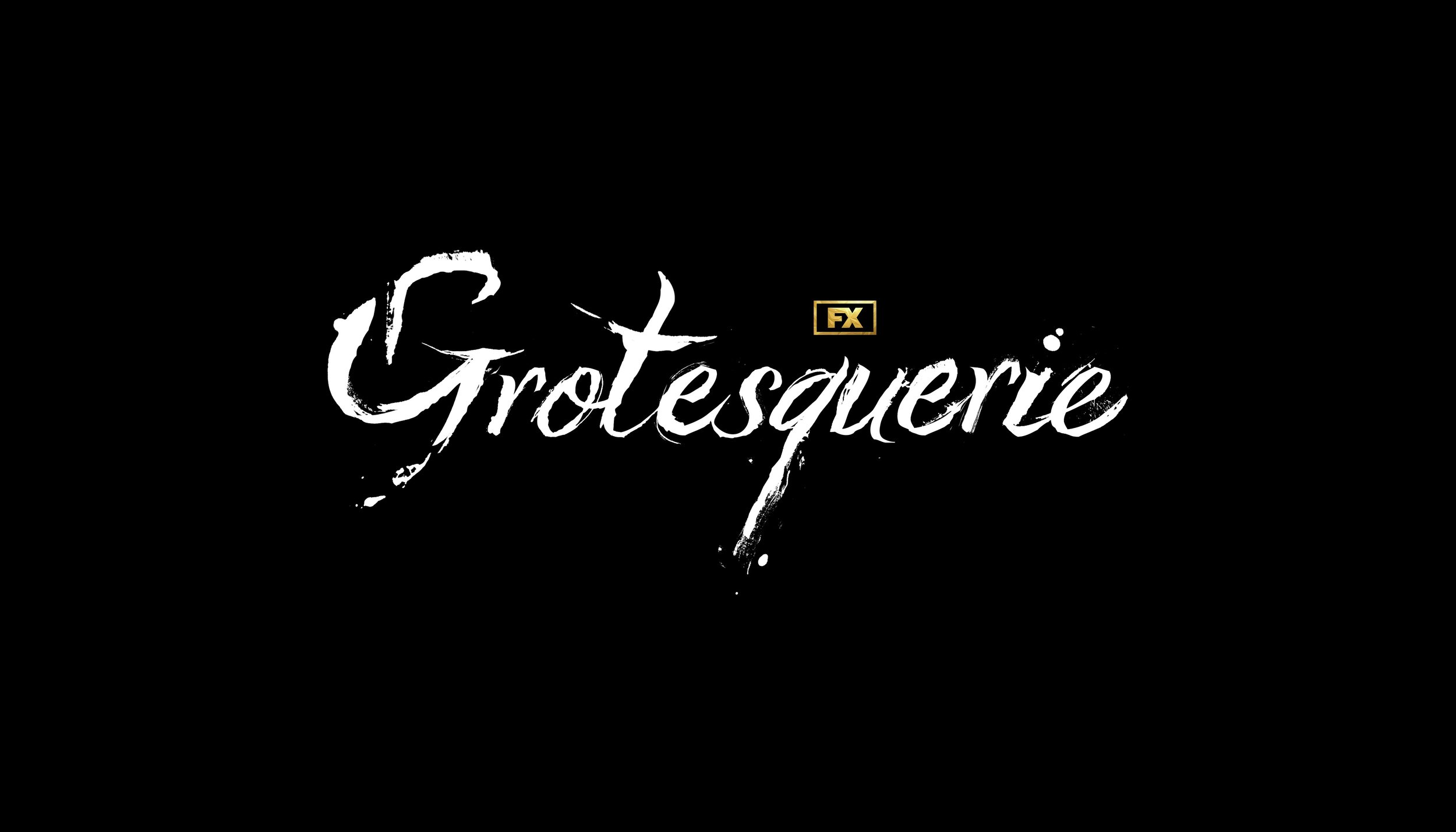
Logo development passes
Building on the custom marks and textures, I extended that visual language into the logo exploration for the marketing package. While the showrunner’s ultimately chose a different direction, this phase allowed me to experiment with forms that captured a sense of creepy elegance—translating the handcrafted, unsettling qualities of the marks into a refined logo concept.
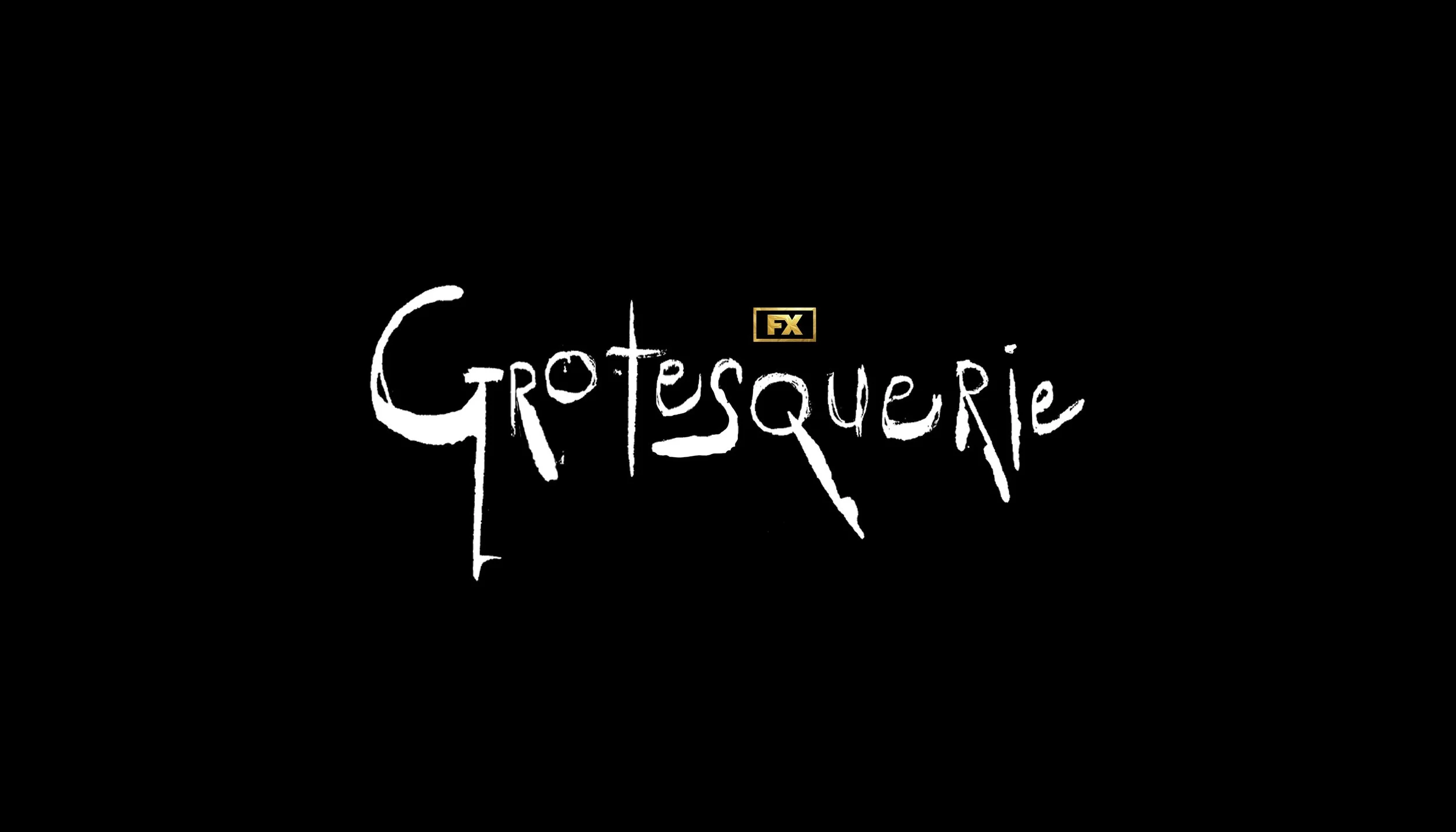
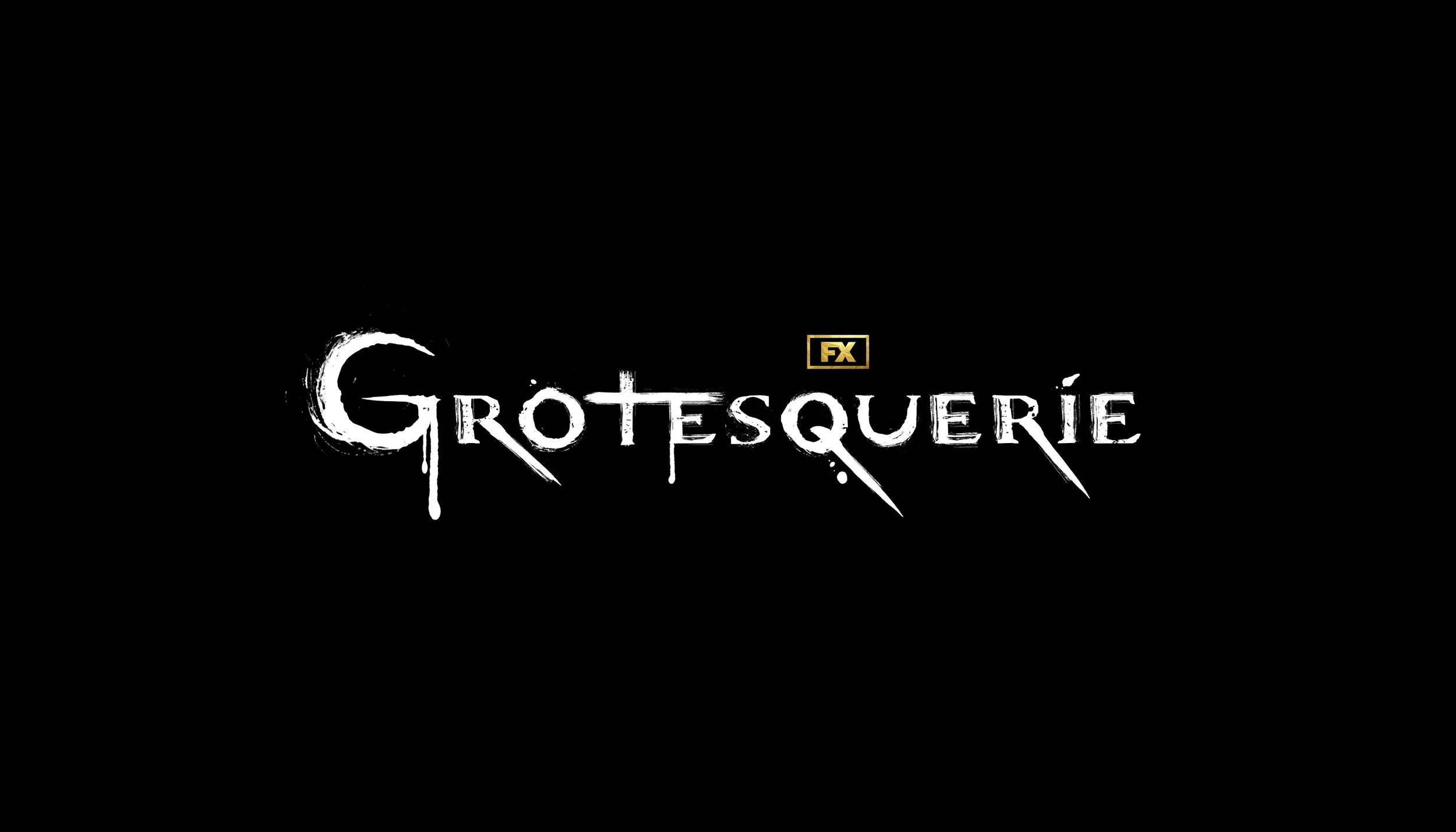
Show Package
For the show package, I assisted in developing the frantic and chaotic scrawl animations and handled the versioning and layout of typographic variations throughout the show package. As well as designing several elements such as the YouTube endpages and linear credit squeeze graphics.