Shōgun was a project I had the privilege of working on, offering a range of unique design challenges. My contributions included typographic layout work within expansive depth-of-field environments, as well as animating kanji elements to bring them to life in a dynamic and visually compelling way.
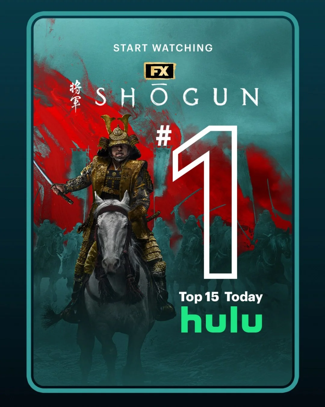
Critic Spots
One of my key responsibilities was designing and animating typography and layouts across various shots used in each spot. This included using rotoscoping techniques to add depth and integration to select quote cards where appropriate, as well as leveraging 3D space to build out the dynamic “quote wall,” giving the typography greater dimensionality and visual impact.
Power Spot
Animating the kanji assets for “Power” presented a unique and rewarding challenge. With guidance and direction, I learned to animate the strokes in the correct traditional order while maintaining a smooth visual flow that integrated seamlessly with the rest of the spot’s design and motion language.
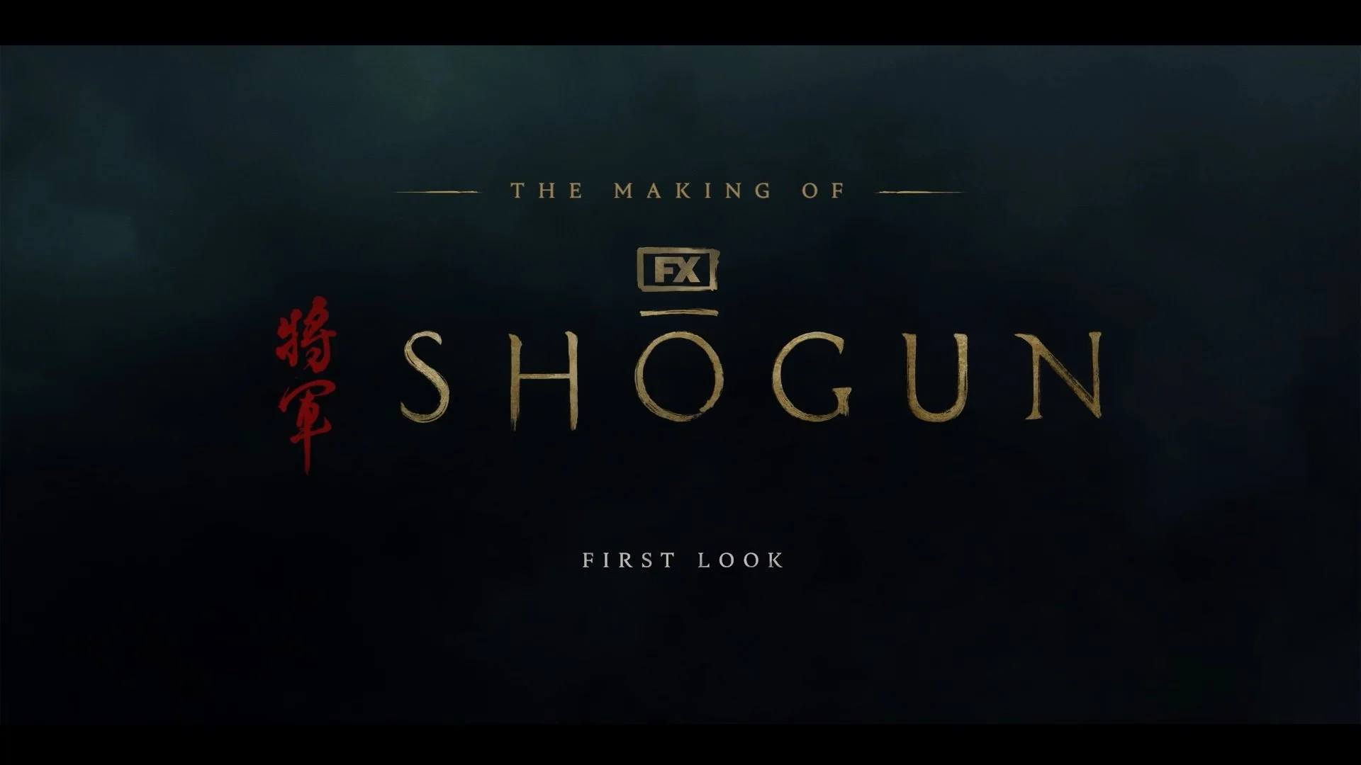
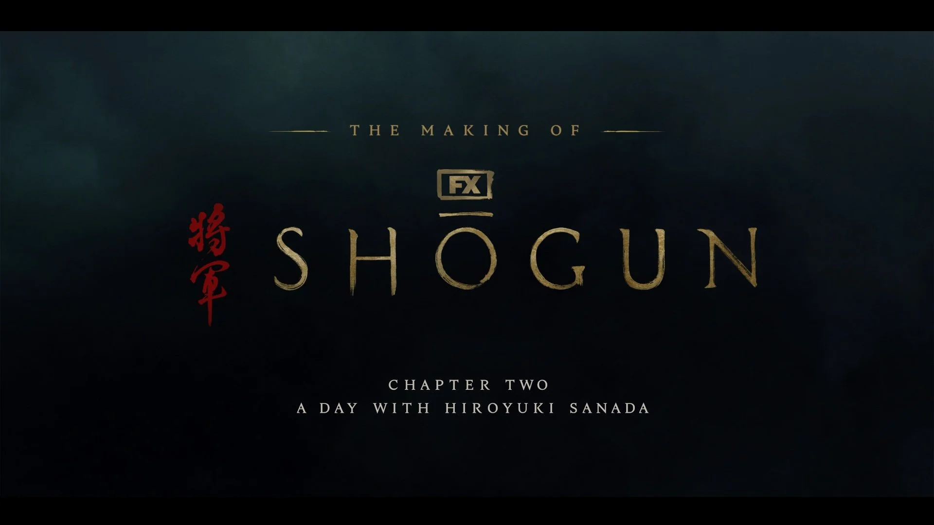
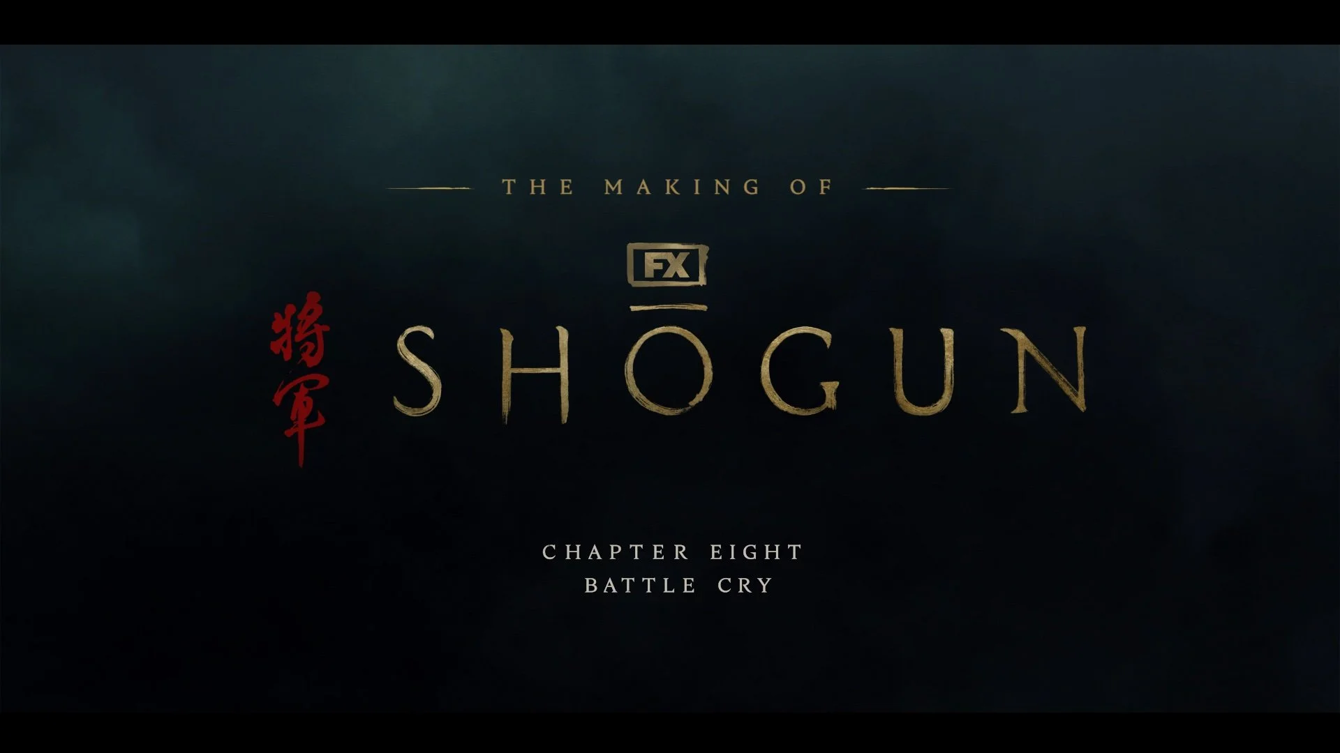
Show Package
There were hundreds of assets created for this season of Shōgun. Working across a wide range of marketing deliverables, I handled typographic versioning for numerous cards, including package IDs and VACs, while also developing typographical layouts for a variety of behind-the-scenes feature pieces. This included typography design for interstitial opens, lower thirds, and supporting graphics for the red band trailer, ensuring consistency and cohesion across all marketing touchpoints.