
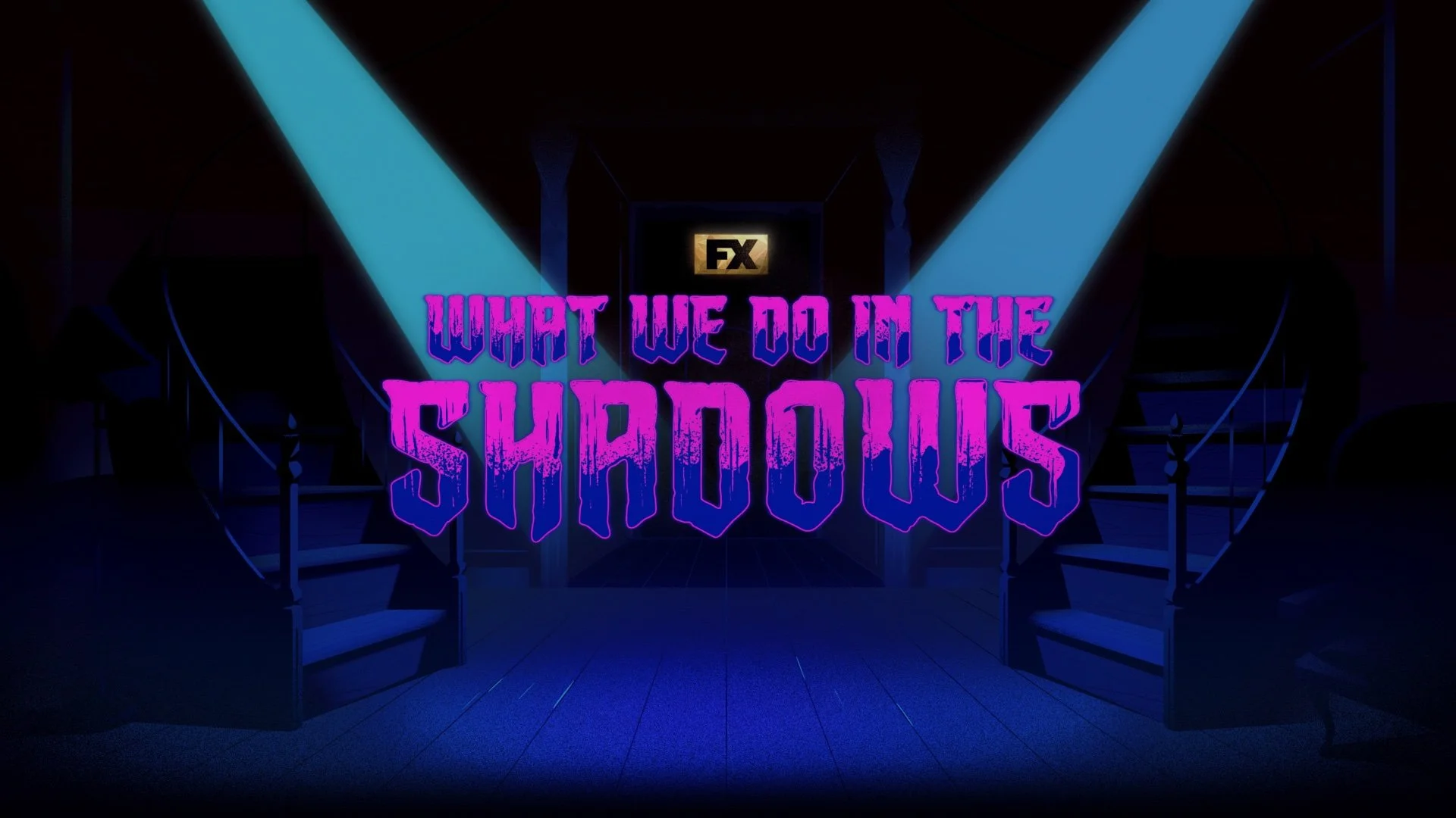
What we do in the Shadows will always be a personal design favorite. Not only for the creative stories that are told with the zany vampires of Staten Island, but also for the wide range of wacky creative design I was able to provide to the various design packages over Seasons 3, 4, 5, and 6.
Majority of my design and animation contributions took place in building and illustrating assets for our Integrated design team and show package elements.
Social and Integrated Design
For Season 6, I had the opportunity to bring a series of character illustrations to life. Using the Duik rigging plugin, I built rigs and animated each character, adding personality and dynamic lighting to enhance their presence on screen. I also collaborated with another artist to rig Guillermo, combining our efforts to achieve a more refined and expressive result.
For Seasons 5 and 6, I was responsible for designing and animating typography for a variety of TikTok spot captions across our social media channels. A key challenge was keeping all type within the platform’s safe zone while maintaining strong composition with the underlying footage. This required thoughtful layout, timing, and visual balance to ensure the text remained clear, engaging, and seamlessly integrated with each shot.
Collaborating with our Integrated Design team has challenged me to elevate both my creative thinking and problem-solving skills, ensuring each asset captures a sense of comedy and wonder while remaining visually effective.
Over multiple seasons, I’ve designed and animated a range of TikTok spots and motion posters, as well as created and edited content for the ABC Supersign in Times Square, New York.
Season 4 Motion Poster
Using key art provided by our print team, I rigged and animated this season’s motion poster. Utilizing After Effects puppet pin tool, I created custom rigs for each talent, then enhanced the scene with subtle lighting animations mapped into the background to bring the high-energy nightclub setting to life.
ABC Supersign
The ABC Supersign projects were always a highlight each season, offering a unique design challenge that blends editing, layout, typography, and motion—while staying within the structural constraints of the sign itself.
I typically began with a 2D build in Adobe After Effects, using existing show package elements or designing and animating new assets tailored specifically for the Supersign. This phase also included editing the featured clips to ensure they worked seamlessly within the overall composition.
Once the 2D pass was complete, I brought the design into Cinema 4D, where I mapped it onto a mockup template and refined it in 3D space. This allowed me to create a fully realized preview of the Supersign, complete with rotating views so the design could be evaluated from all angles.
Below are the Supersign designs for Seasons 4, 5, and 6.
Clubbing Spot
For the “Clubbing” spot, I was tasked with illustrating Nandor (Kayvan Novak) within a series of historical paintings, reimagining his nightlife antics across different eras of his centuries-long life. Created in Adobe Photoshop, these illustrations blended period-inspired aesthetics with a comedic tone to match the character’s personality.
Critic Spots
The Season 4 “Critic” spot was a particularly enjoyable project to design and animate typography for. The edit from our Cut and Editorial team provided a strong sense of rhythm and pacing, which served as a great foundation for developing dynamic yet clear and concise typographic animations.
Alongside designing the 16×9 type and logo assets for this spot, I was also tasked with adapting and redesigning the reformats for various social media platforms. This involved ensuring each version maintained visual consistency while optimizing composition, readability, and impact across different aspect ratios and platform requirements.
Show Package
For the majority of the seasons, I was responsible for versioning out the show packages—carefully laying out typography, refining kerning, and adjusting animations to align with the overall tone and feel of the package. This ensured visual consistency across deliverables while maintaining a cohesive and polished design language throughout.